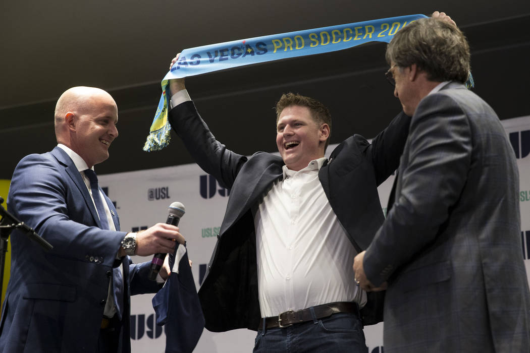
Las Vegas Lights FC releases logo, hopes it carries local appeal — POLL
Las Vegas Lights FC owner Brett Lashbrook learned from his hometown MLS team, Sporting Kansas City, that even the tiniest details in a soccer logo can resonate with a fan base.
Sporting Kansas City’s crest bears a small diagonal line that’s easily overlooked, but locals recognize it as the Missouri -Kansas border. And Lashbrook strived for that same attention to detail when working on a logo for his United Soccer League team, which was released Monday.
“When you’re from Kansas City, you immediately see that and you say ‘that’s cool,’
“Lashbrook said. “It is easier said than done. How do you create a logo for the local community?”
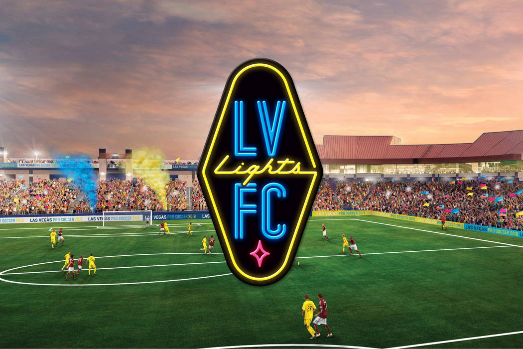
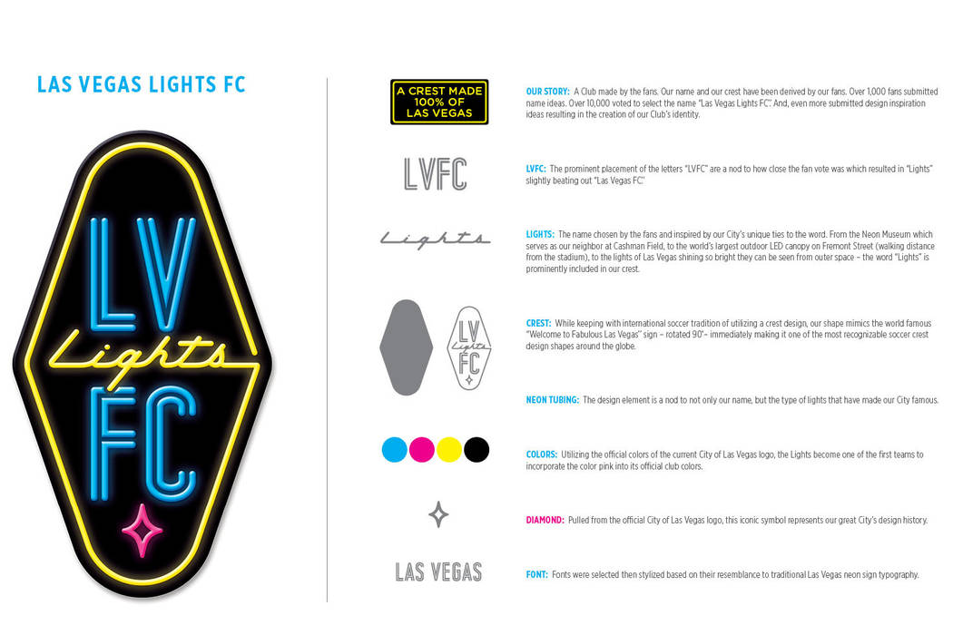
The Lights’ crest is his team’s best attempt, formed with the help of more than 400 fan submissions.
It was through fans that the crest found its shape — the outline of the famed “Welcome to Fabulous Las Vegas” sign turned 90 degrees. The idea to spell things out in neon tubing also came from fan ideas, modeled partially after the lettering used by local music festival Life is Beautiful.
The colors came from submissions, too. The Lights first put out a placeholder logo in which they didn’t intend the colors blue, yellow and pink to be official. But the colors became official after many fans submitted those colors, which come from the city of Las Vegas logo.
“They’re brighter colors,” Lashbrook said, noting that many of the other pro sports teams in town use darker shades. “The ability to have a different shade or brightness I thought was good.”
Lashbrook, who helped Orlando City SC get on its feet in the MLS, thinks he can use the team’s unique colors to stand out much like his previous team did in a new soccer market.
“The thing that stuck with me from my time in Orlando was having a different color. In Orlando, we used to own the color purple,” Lashbrook said. “There’s only so many cities where you can get away with the color pink.”
The color pink is featured on the crest in the star at the bottom, which is based off the stars seen in the city of Las Vegas logo.
The “FC” is featured in big letters above the star, as a nod to the name that finished runner-up to Las Vegas Lights FC. Fans voted more than 10,000 times to select the team’s name and the more traditional Las Vegas FC came in a close second, so those three words were featured prominently in the logo.
“I think I am really proud that the club is representing the traditional soccer shield, but we’re putting our own Vegas twist on it,” Lashbrook said. “We’re Vegas-ifying the sport. This is Las Vegas, and I think this sign embraces and reflects the community.”
Contact Ben Gotz at bgotz@reviewjournal.com. Follow@BenSGotz on Twitter.
Related
Las Vegas Lights FC owner 'ecstatic' to become Cashman's primary tenant in 2018
New United Soccer League team will be called Las Vegas Lights FC
Las Vegas approves United Soccer League team for Cashman Field in 2018
Brett Lashbrook goes all in to make Las Vegas a soccer town


