Logo lesson: Henderson, other cities can’t please everybody

What goes into creating or updating a city logo?
For the recently dumped and restored logo for the city of Las Vegas, it was $20,000 and a whole lot of controversy.
For Henderson, it’s history and town pride mixed with some debate. In the 64 years since the city was incorporated, Henderson has had three logos — or two, depending on whether you count the city’s first seal, which doesn’t contain any images.
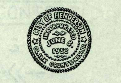
The city’s first seal simply read “City of Henderson, Clark County” along with the city’s incorporation date of June 8, 1953. The text was placed within two concentric circles.
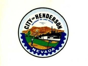
The city’s second logo came in September 1969, when a design by Rozzi Commercial Artists was adopted. The image depicted a golfer, a biplane and Basic High School’s landmark letter “B” on a Henderson hillside. Under “City of Henderson” the logo reads “Gateway to Lake Mead.”
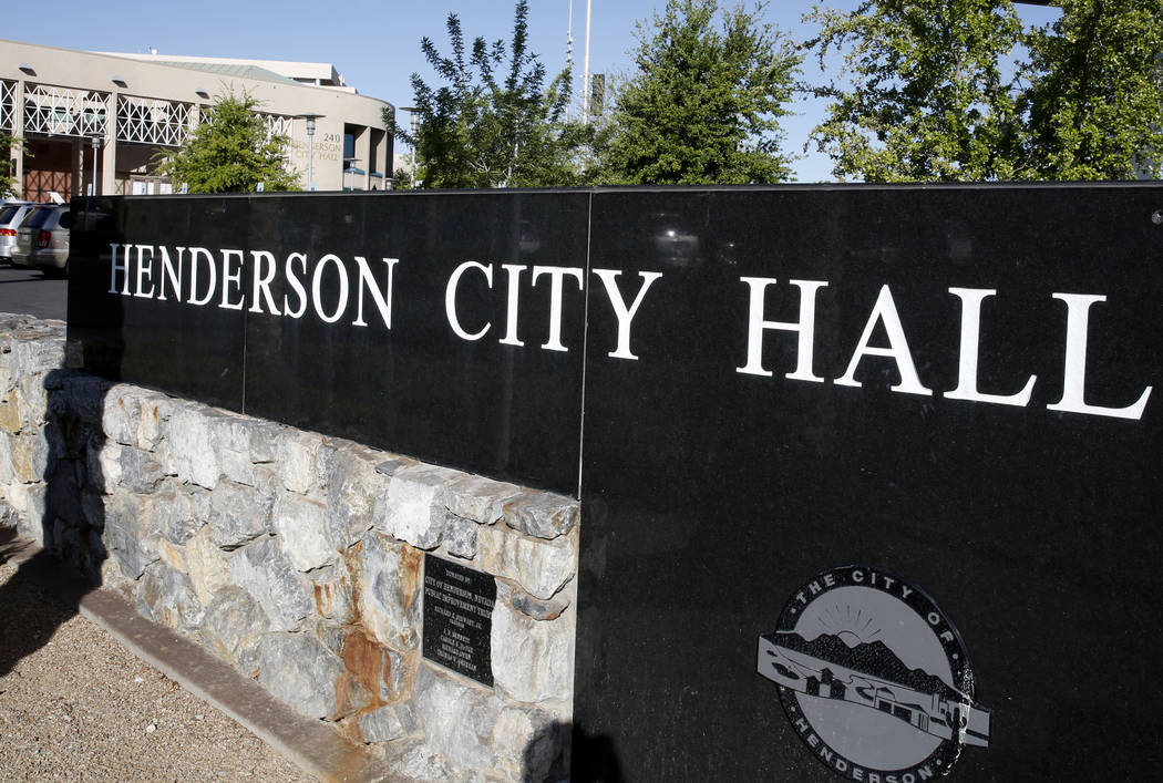
The current logo, adopted in November 1993, can be found on the city’s welcome sign, its website and official city materials and business cards. It was designed by Communications by Design to create a more contemporary look for the city.
The logo “has become a familiar symbol that is instantly recognizable …” said David Cherry, communications manager for the city.
A Nov. 18, 1993, edition of defunct Henderson Home News reported that the logo “… is intended to project a ‘dynamic community of the 90s.’”
According to a Dec. 2, 1993, story in the Home News, the concept of the updated 1969 logo had been around for eight years before it was changed. The new design was implemented after the city joined forces with the Henderson Development Association, a division of the chamber of commerce, to “develop promotional folders to distribute information to interested businesses scoping out the city.”
Henderson’s economic development director at the time, Ann Barron, told the Home News she thought the colors were “warmer and more inviting … It’s clearer and easier to read.”
It wasn’t until three years later that the city held a contest for a new slogan. Top entries included “A city of growing opportunities,” “The city of promise and progress,” “A step above, a step ahead,” “Preserving the past, building the future” and the winner, “A place to call home.”
The city also received some humorous suggestions: “Always been hot, only getting hotter,” and “We are the Prickly Cactus people.”
In 2013, former City Manager Jacob Snow proposed changing the logo, which he thought looked like a “hamburger.”
Snow later backtracked on his proposition, which would have rid the logo of its saguaro cactus, a plant that is not native to the Mojave Desert.
The city has no plans to change the logo, said city spokesman Keith Paul.
Contact Madelyn Reese at mreese@viewnews.com or 702-383-0497. Follow @MadelynGReese on Twitter.
Reporter’s notebook
The history of Henderson’s logo was surprisingly difficult to track down. Besides two 2013 Las Vegas Review-Journal articles about Jacob Snow’s proposal to change the logo, I couldn’t find anything in the newspaper’s archives. As I called city officials, many suggested I talk to someone else (who I had often already called).
Even Mark Hall-Patton at the Clark County Historical Museum was stumped. Calls to Henderson’s communications department were not fruitful, though they did the best they could to help.
I finally received a suggestion from Rick Watson at the Henderson Historical Society to browse the Henderson Libraries Digital Collection, where I stumbled upon a gold (silver?) mine.
The library has an extensive digital catalogue including copies of the Henderson Home News dating to 1949, old aerial photos, even a copy of the program from the Sep. 9 1967 dedication ceremony of Henderson’s post office.
There are also oral histories on a variety of subjects, including the 1988 PEPCON disaster, the development of the Green Valley neighborhood and the old Victory Theater.
It was difficult not to get lost while reading, watching, listening to and looking at all of these historical riches.
For a newcomer to the area, the digital collection at Henderson Libraries was not only a life saver, but a brilliant discovery I’ll likely return to time and time again.
Madelyn Reese/View


