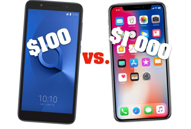
How does a $100 smartphone compare to a $1,000 flagship?

If you buy a smartphone for $100, how much are you really missing out on compared to higher-end phones?
I recently tested the new Alcatel 1X and pitted it against an iPhone X (pronounced “ten” – fitting because it costs ten times more).
It is undoubtedly impressive how much you get for $100, nowadays. Now it’s a sizable 5.3-inch display, fingerprint security, a digital camera and camcorder, web access, and enough storage for several thousand songs.

In your hand, the Alcatel 1X has the vibe of an upscale phone. It’s equivalent in size to an iPhone X but weighs 20 grams less.
However (and this is pivotal), for all its size and shine, the 1X lacks “vroom”. It’s a go-cart engine in a race car body.
The 1X uses a stripped-down version of Android – Oreo Go – which takes up less space and includes smaller versions of built-in apps for better performance. Notably, Oreo Go allows Google Assistant to run on smartphones with 1GB or less of memory.
Outside of Google’s optimized apps and basic programs, you won’t want to try anything complex on the 1X. Logging into apps for the first time, even Facebook Lite and Messenger, will cost you several minutes. I downloaded a few games from the “most popular” section of the Google Play store. They took so long to load that I could have gone to lunch. At times I mistook a black loading screen for the phone turning itself off. Once games do load, expect dropped frames and crashes to ruin the experience.
The costlier competition opens processor-intensive apps without a sweat. The 1X, in contrast, feels like it can barely support today’s apps, let alone anything coming in the future.
The Alcatel’s performance issues extend beyond apps, though.
Even on-screen buttons take an inordinate amount of time to activate. On more than one occasion I tapped to open an app and was able to swipe to a different page on the home screen before the app opened.
I found myself frequently tapping buttons multiple times to ensure I had placed my finger just right, only to see a toggle or menu confusedly flash back and forth a minute later, trying to catch up with my earlier actions. Scrolling, too, felt jumpy at times.
Sometimes when the phone is asleep, an LED indicator light will pulse nonstop on the front. I couldn’t find any explanation in the manual. I eventually determined the light stayed lit when the phone charges and pulses when there are unread notifications. Thus, a small benefit. On the thousand-dollar competition, there’s no glanceable way to know whether you have unread notifications or if the phone is charging, short of touching the device.
For listening from the palm of your hand, the phone’s speaker is perfectly acceptable. It’s only half as loud as the iPhone’s speakers, but does the job.
The camera

The camera on the Alcatel 1X produces acceptable photos in good lighting. The biggest challenge is the shutter lag from the time you press the button.

Well-lit photos look almost as good as iPhone shots, but with less vivid color. Even heavily cropping a photo gave me similar results, despite an extra 4 megapixels on the iPhone.
The most indistinguishable photo was a macro shot of a flower. In my opinion, it was where Alcatel’s camera shined most.
After that, the similarities end.
Photos using flash in dark environments and images from the front facing camera were not as sharp on the 1X. Backlit photos on the 1X are noticeably worse and action photos more blurry.
Despite recording at the same HD resolution, my video from the iPhone was sharper and more vibrant. Scariest of all, videos on the 1X skip some frames early in recording.

Differences
Other differences between the two phones highlight the small touches on Apple’s product: fingerprint smudges are less visible, volume can be adjusted from the earbuds, Face ID is faster than a fingerprint, and the beauty of portrait mode’s digitally-added camera bokeh.
Is the 1X for you? If you want an impressive-looking phone at a low cost, go for it. If you have more time than money in your life, go for it. However, spending a bit more to get faster results and save hours of your life seems worth it to me.
Send your questions and feedback to hkeely@reviewjournal.com and follow me on Twitter: @HarrisonKeely.


